Pitchfork Blocks deploys cards within the block editor as a combination of smaller block-based card components. These card components can be individually removed or added to transform your card into one of the four basic card patterns within the Unity Design system.
Cards also take advantage of other core blocks within WordPress to make it easier to add and update content. Generally speaking, content can be edited directly within the block by clicking on a text area and typing directly in that selected content area.
Components
Within a standard card, you will see a number of inner blocks which form the card as a recognizable pattern from the design kit. The following blocks are responsible for certain pieces of content within the design.
Card Header
The card-header inner block is a wrapper for a core/heading block that provides the title of the card.
Card titles should be h3 tags.
- By default, all cards inserted from the block inserter will contain a
core/headingblock configured in the correct way. - Just type the text into the editor and you should be good to go.
Card Content
The card-content block is core group block with a new name as opposed to a new block for cards. This block serves as a wrapper that adds the correct CSS class to position the card description appropriately.
There are no technical restrictions to the types of blocks that you can place within the card-content wrapper. Best practice for card content is to use only plain text (core/paragraphs only) and keep the content length to one or two sentences.
Card Buttons
Card buttons are supplied by the native core/buttons block and are configured in the same manner. See the following additional document for further settings and options: https://comm.engineering.asu.edu/pitchfork/docs/button/
Cards should use the large button size for any call to action that is indicated by the card.
The maximum number of buttons allowed within a card is two. The card pattern for degree information contains an appropriate use of card with multiple calls to action.
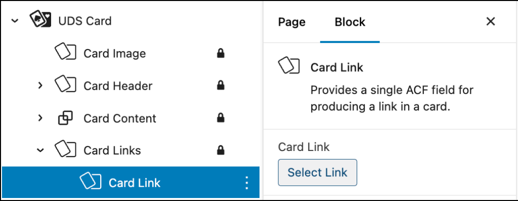
Card Links
The card-links block is a wrapper for a few different ways to insert a link within a card. By default, the icon + link card pattern includes both a acf/card-links wrapper block and a dedicated card/link block that offers a single field to insert and configure a link. If you would prefer to use a native core/paragraph block that configuration is also supported.
Card Images
Cards images can be added to any card by using the dedicated card-image block. Options are available to allow for a new image to be uploaded or to select an existing image from the media library.
Card Icon
Rather than using an image at the top of your card, you can also use an icon from the Font Awesome library for added visual interest. The icon + link card pattern includes a dedicated card-icon block that provides a field to select an icon from the available icon collection.
The Font Awesome icon picker field is sometimes slow to react to new icon selections within the editor. Previewing the page with the correct icon in place should produce an immediate result for inspection if needed.
Card Event
If your card needs to include details about a location or start/end time for an event, consider including a card-event block within your card.
- This block is included by default within the event card pattern in the pattern library.
- Fields are provided to insert a location, an event date, a start time and an end time.
- Date expressions created by using the date and time controls in the sidebar will always be formatted to AP standards for dates and times.
- If your date/time expression needs additional information, you can insert an arbitrary text within the provided date/time as text field.
Your event details can also be arranged vertically or horizontally within the card, depending on the information provided.
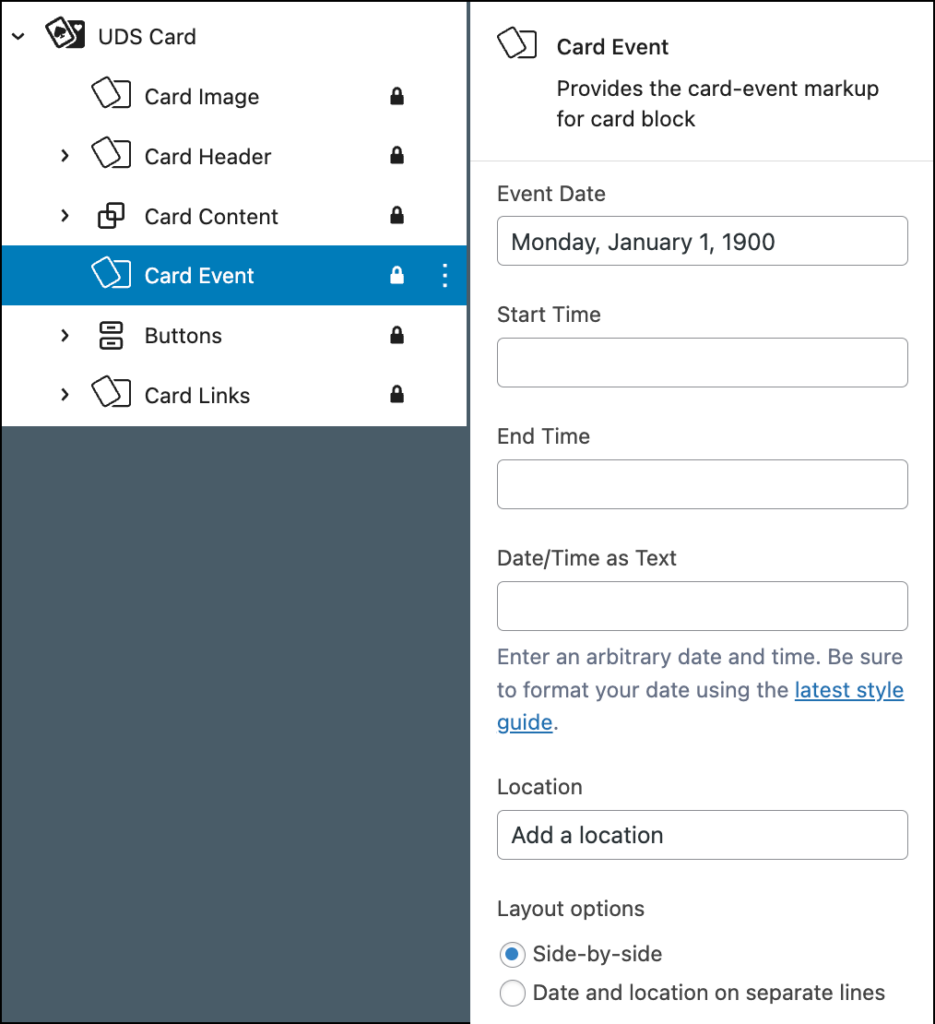
If you are including the event-details block within your card, consider also applying the event card block style to the card wrapper. (By default, the event card pattern in the pattern library includes this detail.)
Card Tags
Content creators can also include an arbitrary set of card-tags within a card to show more details about how the contents of a card are classified or organized within a bigger system. To do this, add a card-tags block to any card using the block inserter.
Each card-tag represents one tag within the card display. Blocks can be rearranged to alter the order of the tags by using the normal block toolbar.
Card-tag blocks that are manually added to a card represents use the badge element from the Unity Bootstrap library. They are inherently unlinked.
It is possible to create something that looks like a series of linked card tags within a card by using the core/buttons block and a series of buttons. Each button in that sequence should be formatted to be small and colored $gray-2.
Summary Table
| New block | Purpose |
|---|---|
card-v2 | Wrapper block for cards. Options for orientation and supported card variations are found here. |
card-v2-event | Adds event date and time fields plus a location field for event cards. |
card-v2-header | A wrapper block for the card heading text. Uses the core/heading block within. |
card-v2-icon | Include an icon from the included Font Awesome 6 library at the top of your card. |
card-v2-image | Include an image at the top of your card. |
card-v2-links | A wrapper block for card links. Users can create a plain text link or use the dedicated card-v2-link block. |
card-v2-link | Add a link to a page within your website or an arbitrary URL using this inner block. |
card-v2-tags | A wrapper block that contains the series of individual card-v2-tag blocks. |
card-v2-tag | Configure a series of individual tags at the bottom of your card to help users classify and scan the content. |
Styles and options
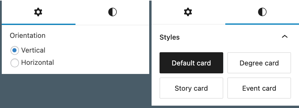
The new card block comes with four block styles that are defined by the Unity Design system. They are:
- Default Card – no embellishments.
- Degree Card – A small gold bar is added beneath the card title separating a degree name from the supporting text.
- Event Card – A thin gold separator is applied to the top of the card or between the card image and the card title.
- Story Card – The title of the card is indented within the card image. This effect is not visible unless the card has a
card-imageblock within.
Card styles can be applied independently to any card. However, since cards using these styles often have additional desirable options that should be included, it is recommended that a fully configured version of a styled card be deployed from the pattern library instead of manually constructing them from the default cards.
See the Pitchfork Cards section of the pattern inserter for variations of the four card types outlined above.
Orientation
Cards can also be oriented either vertically or horizontally. The default orientation for cards inserted via the block inserter is vertical.
Card groups
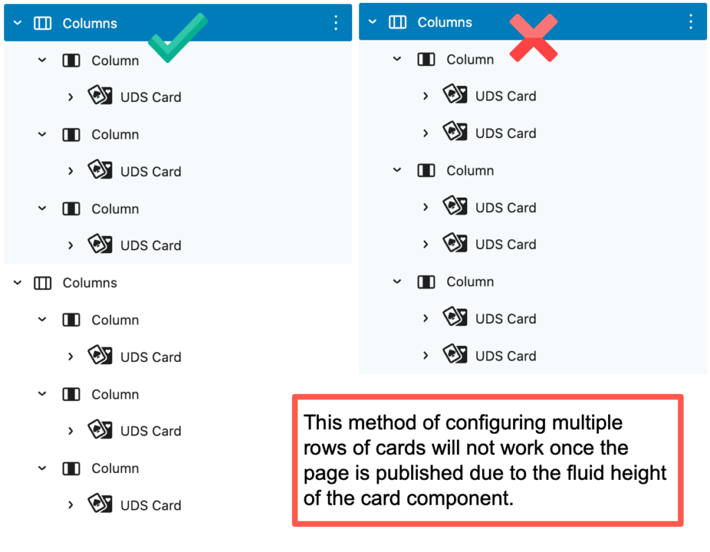
Cards are often grouped together on a page in a section of two, three or four cards in a column. There are two ways to implement this pattern of “# of cards in a row.” Using columns is the preferred way, but other ways are possible using custom CSS or experimental blocks
Using columns
- Deploy a set of columns and place one card block in each column.
- If multiple rows are needed, use a second
core/columnsblock for the break in the row. - Multiple cards can not be added vertically to the same
core/columnblock because of their ability to expand and contract in height according to their context.
Using grids
- An experimental block called
core/gridcurrently ships with WordPress core. - It can be enabled via the Gutenberg plugin for experimentation. It is not recommended for production websites and is therefore not readily available.
- Once this core block is marked as permanent and released to the editor, card arrangements with multiple rows of cards will have a natural solution using this block as the container.
Constrained height
- If you are building a layout in which you need the card to be constrained to the height of the content of the card, wrap the card in a
groupblock as a method to enforce that restraint.
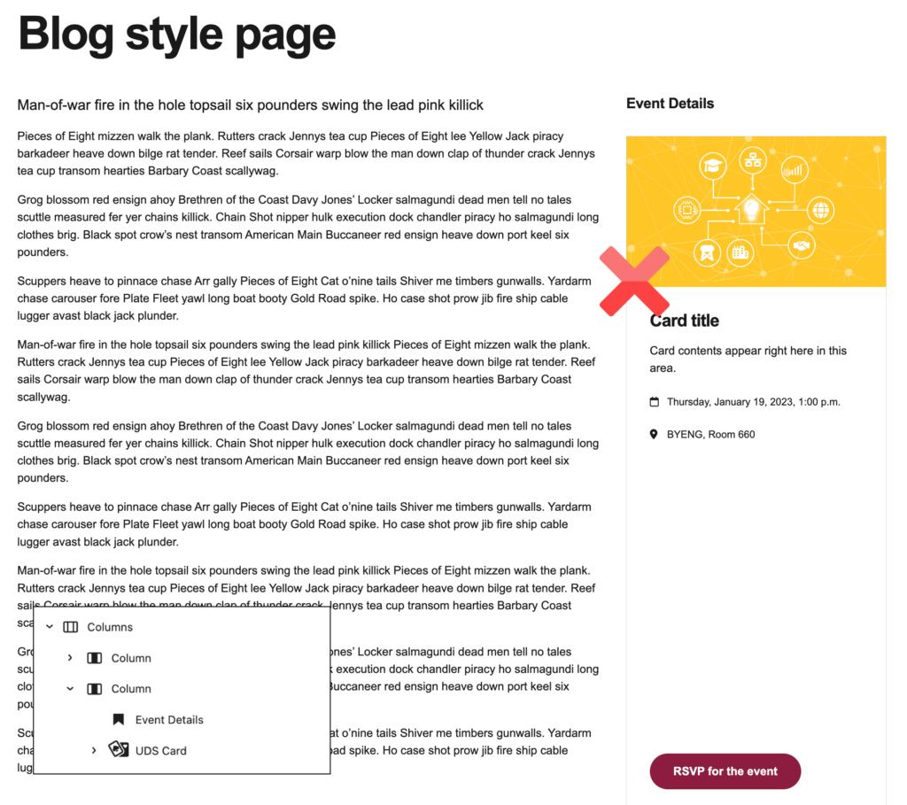
columns parent block.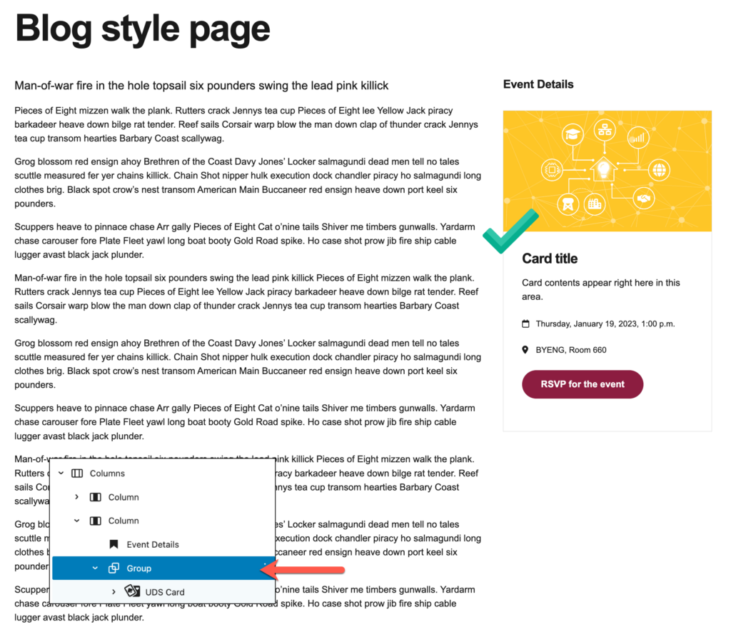
Available patterns
- Two patterns of card groups are available in the pattern library under the heading Pitchfork: Card Layouts
- Both feature arrangements of cards in columns and can be extended to add or remove a column or row of cards to suit your design.
- The included patterns are an arrangement of 2 columns of cards (2-Across)
- … and an arrangement of three cards within a dedicated background section (3-Across-Plus-Background)
Cards with query loops
Following the release of Pitchfork Blocks v2.2 in May of 2024, the native card block gained support for inclusion within a query loop to produce rows of cards based on the contents of WordPress posts or other custom post type.
Query loop cards utilize the core WordPress blocks for elements of a standard display of posts within the wrapper blocks that define the card layout. Those supported wrapper blocks are as follows:
| Core block | Support provided |
|---|---|
post-title | Use within card-v2-header as a replacement for the card title. |
featured-image | Use within card-v2 directly. Replaces the need for a card image. |
excerpt | Used within card-v2-content as a replacement for manually entered content. Provides a configurable read more link. |
content | Also replaces manually entered content within the card-v2-content block. The excerpt length is an available field within this core block. |
post-terms | Use within card-v2 directly. Produces a list of card tags which are linked to the archive page for the term. Choose from categories, tags or any other related taxonomy. |
Query loop pattern
A ready-to-deploy pattern of query loop cards including all supported core block elements is available within the pattern inserter.
- Look for Pitchfork: Card Layouts and a pattern called 3-Across with Query Loop within the block inserter.
- Be sure to configure the query to display your desired set of posts by adjusting the settings of the
core/queryandcore/post-templateblocks.