Colors and sizes
The Unity Design System allows for buttons to one of four colors and one of three possible sizes.
- Sizes: Small, Medium and Large.
- Colors: ASU Maroon, ASU Gold, ASU Gray 7 (black) and ASU Gray 4
The default color and size of a button is maroon and large.
Gold buttons should be reserved for the most important call to action on a page that has multiple buttons within the design.
Large buttons are the correct size for almost all applications of a button within the design system.
Data layer tracking
By default, a button will not supply the needed data-ga tags within the markup to submit the event to the GA4 data layer.
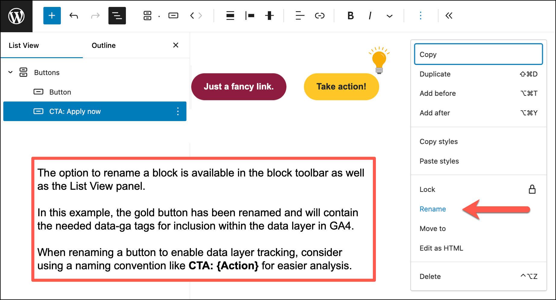
Users wishing to track the activity of a particular button within Google Analytics can enable that behavior by supplying the individual button with a unique name. The option to rename a block appears in the toolbar associated with that block as well as within the Document Overview → List View pane.
- The name supplied to the button block will be assigned to the
data-gaattribute of the button. - All other
data-ga-*attributes will be added automatically according to the data layer specification within the unity design system.
A recommended approach for renaming a button is to use a naming convention like CTA: {Action} for the button name. That will help to delineate which call to action is being tracked within the analytics package.