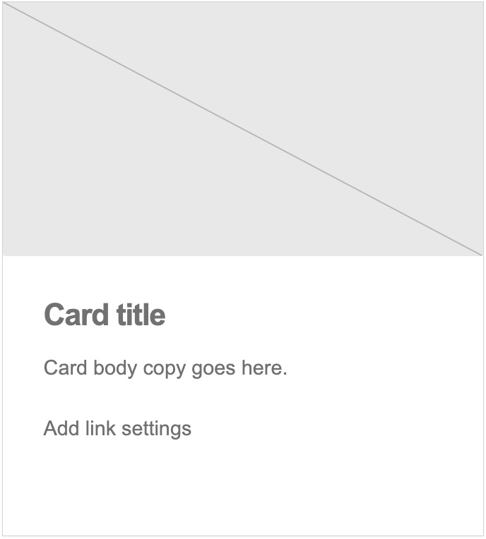
Card: Image + Link
This pattern substitutes the core/button that is included in the default card pattern for a link which provides the call to action.
Features
- A
cardblock set to the default card style. - The dedicated
card-linkblock.
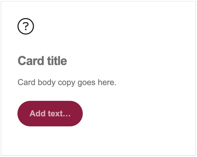
Card: Icon Header
This pattern provides for a way to choose an icon to represent the contents of your card instead of a more traditional card image.
Features
- A
cardblock set to the default card style. - The
card-iconblock which allows you to choose a Font Awesome icon.
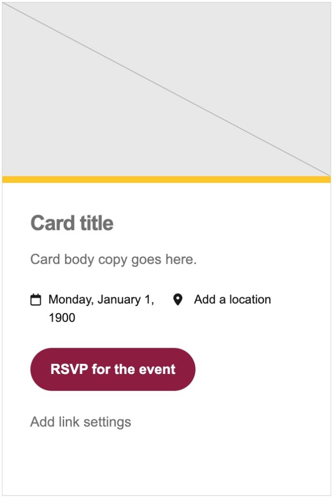
Card: Event
Event cards contain an easy way to input a date and time for a potential event or gathering. They are also configured with both a call to action button (typically a registration link) and a link for further details.
Features
- A
cardblock set to the event card style. - Removing the card image from the block will still continue to display the gold highlight across the top of the card.
- A dedicated block for
card-eventwhich formats the dates and times in AP style.
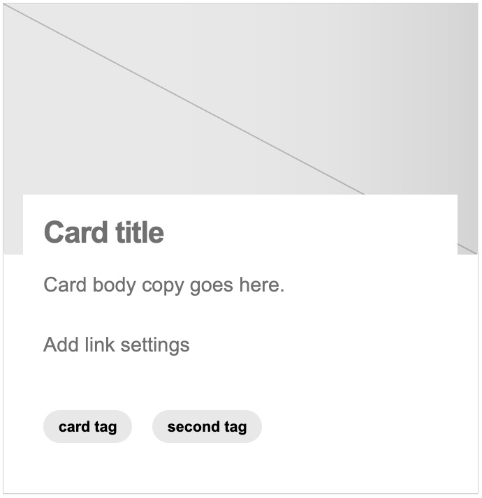
Card: Story
Story cards represent ways for page builders to present a summary of a blog post or news article using a dedicated card design.
Features
- A
cardblock set to the story card style. - Examples of
card-tagsthat can be added to enhance and further classify the represented story into appropriate categories.