Insert the block
You can find this block within the Pitchfork Blocks section of the block inserter or by typing /background into the block editor.
The block is inserted onto the page along with a core/group block as the starting point for inserting content within the section.
The group block that is included by default does not have to be used when creating your content section. You may safely delete it or convert it to another layout block like the core/row or core/columns block instead.
Alignment and Spacing
You can alter the margin settings of the block within the styles pane of the block settings panel.
- The background section block uses the WordPress default block margins to a define a fairly small margin above and below the block when first deployed.
- Please keep in mind that sections within a page normally need to maintain a margin of 96px (UDS Size 6) between the text and the background image or color.
- Additionally, sections need to maintain another 96px (UDS Size 6) break between two sections on the same page.
- See the Spacing and Layout illustrations within the Unity Design Kit XD document for more details.
The block has two alignment settings: align none and align full.
- The align none setting will make the background section conform to the normal width of the page (1200px).
- The align full setting will extend the block to the edge of the screen (1920px).
Block settings
You may choose one of three options for your desired background color or image.
No Background Pattern
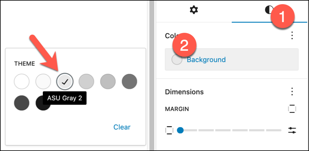
If you need to create a solid color background section for your content layout, select the No background pattern option and apply a background color directly from the styles pane in the right sidebar. The approved choices for background colors within the Unity Design system are available in the color picker.
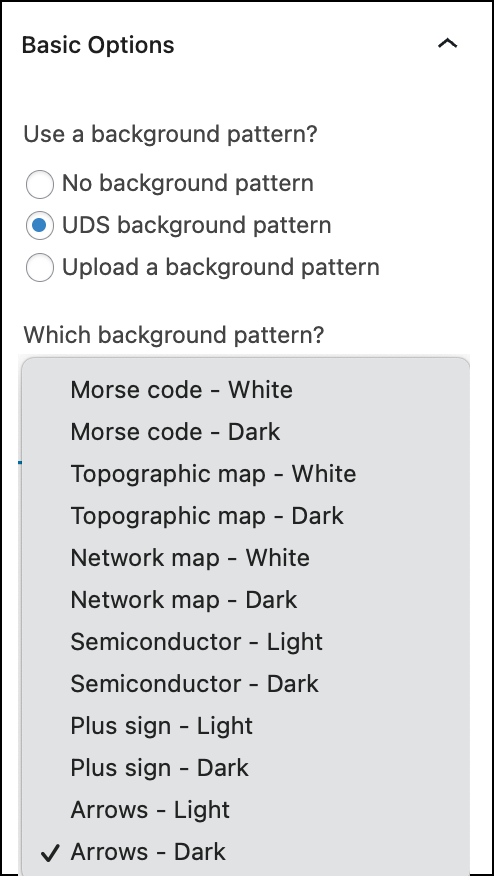
UDS Background Pattern
- All approved patterns from the Unity Design Kit are included as options within this block.
- Select your choice from the dropdown to see the background pattern change.
- You can also view samples of the entire list of approved background patterns in the Unity Storybook component explorer.
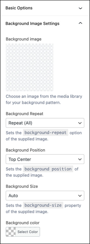
Upload a background pattern
- The Upload a background pattern radio button exposes a separate panel with a field for uploading an image to be used as a background for the section.
- The Background Image Settings panel provides additional options for manipulating the position, size and repeat settings of the background image. The settings applied to the block are the CSS rules for background-repeat, background-position, background-size and background-color.
Accessibility
When using one of the included background patterns or an uploaded image of your own, please make sure that you are creating enough contrast between the background image and any included text that you want to appear in the foreground. See WCAG 1.4.3 for additional details.
- Very often, the background pattern will provide too much visual interference with text inserted directly on the foreground. This makes it harder for site visitors to read the text.
- Instead, consider applying a solid background color and some additional margin or padding within a layout block in the foreground to create a visual break between the text and the background pattern.
- Applying a unity highlight color to a heading is also a good way to maintain enough contrast between text and the background image.
- Using a
core/grouporcore/columnsblock as a container for your overlay text also provides additional opportunities to create the visual break needed between text and the image.
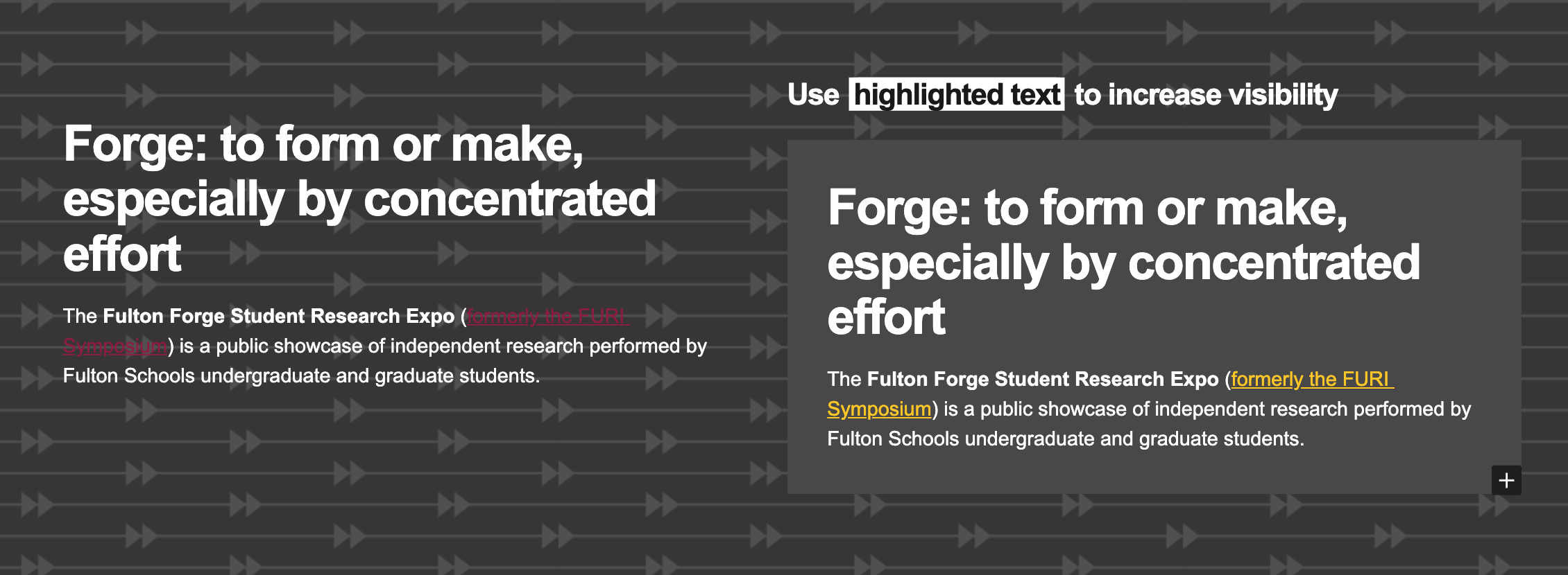
The text in the right column shows the effect of adding proper margin/padding around a text section as well as other techniques that result in a more accessible message.
Want to know more about accessible text and background images?
The excellent article Designing Accessible Text Over Images: Best Practices, Techniques, And Resources (Part 1) from Smashing Magazine covers this topic in much greater depth.